Towards the end of last year, we connected with Corey from NE Accounting & Tax to improve the NEAT branding and boost his website and social media presence.
We began with a meeting to learn about NEAT’s journey, understanding the story behind the business and why Corey wanted to enhance the branding and online presence.
Before diving into online aspects, we reviewed the current branding to grasp what changes Corey desired and the reasons behind them. Corey liked the original logo design but thought it needed a modern touch.
Our goal was to honour the original design by keeping the three diamond shapes while giving it a refreshed look with new colours and rounded corners. Paired with a modern sans-serif font, this created a winning combination that brought new life to the overall aesthetic.
Accounting is often seen as a dull subject with traditional and muted branding. However, there has been a noticeable shift in recent years, with disruptors like Monzo, Wise, and Revolut breaking away from conventional norms in the banking and finance sector. Aligning with our commitment to create lasting and contemporary branding for NEAT, we chose to follow a similarly innovative direction.
Using vibrant and complementary colours not commonly seen in the accounting field, we ensured that NEAT would stand out. These colours not only blended well but also established their unique identity. Embracing the trend of decorative 3D illustration in design, we incorporated it to add a modern touch to the branding. This fusion of 3D accents with 2D elements introduces a modern depth, reflecting a forward-thinking and disruptive approach within the industry.

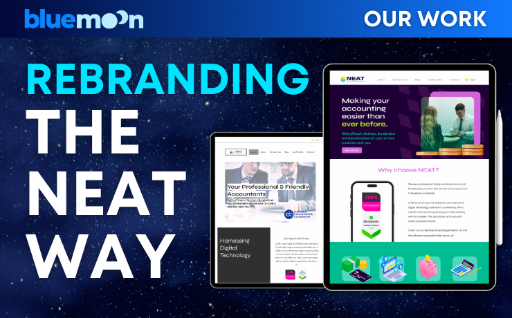
The NEAT website really needed an update. Even though the information was good, the design looked old-fashioned, was all over the place, and didn’t reflect NEAT as the professional and experienced accounting firm it is. We made simple changes like using the same fonts everywhere, adding unique pictures, and sticking to the new colours. These changes helped create a website that truly represents NEAT in the way it should.

For NEAT’s social media strategy, we started off by conducting a thorough social media deep dive into their industry which helped us to understand where their target audience are spending their time. This established what content would resonate with the NEAT followers and what content we should be posting. We then created content pillars to act as our anchors for creating content and produced a 3 month content plan to give us a clear and concise posting schedule.
Lastly, we conducted a content day dedicated to capturing amazing photography that we could use on the NEAT socials to make them stand out against competitors. We were able to ditch the accountant stock imagery and be 100% authentic to the brand, which adds a much more personal touch for clients.
The social media results speak for themselves—just check out the stats!

And that’s a wrap on the entire NEAT rebranding journey! We had a blast working on this project, and have loved continuing to support NEAT with their social media!